As developing a product for a tablet computer, the iPad appears. Because it was matching perfectly with our requirements, we were trying to get the existing browser application as close to a native iPad app as possible. I want to share my research of special and nearly unknown parameters in HTML and CSS in a series of posts.
Menu bars:
One part is the usage of the entire screen without the address bar or other menu icons. If you open Safari on the iPad, you will find a menu bar at the top of the screen. If you open Safari on the iPhone or iPod Touch, you will find two menu bars, one at the top and one at the bottom. This is caused by the screen size, which is much larger on the iPad.
After loading a long website on the iPhone or iPod Touch, the address bar is hidden on top of the page. The normal menu bar at the bottom of the screen is always visible (in normal browsing mode). The long menu bar with the address input area is always visible on the iPad. This is not dependent on the orientation of the device.
iPad


iPhone/iPod Touch


To get the full-screen mode for your application, you need three things:
- a full ajaxified app (multi-page apps don’t work)
- the meta tag apple-mobile-web-app-capable
- the app saved on the home screen
The important part for your web app is the code:
<meta name="apple-mobile-web-app-capable" content="yes" />Another little thing is the small bar on top of the page with the Wi-Fi intensity and battery indicator. It isn’t possible to hide this bar, but you can choose if it is black, white, or translucent. A translucent bar is helpful if you want to avoid zooming because the content is now full-screen and is using the entire screen, with the small menu bar translucent on top of the screen.
To achieve this behavior, you can use the following code:
<meta name="apple-mobile-web-app-status-bar-style" content="black-translucent" />All these parameters are unused if you enter the address inside the Safari application. You need to open the page and save it on the home screen, which is in the same menu as the bookmark function.
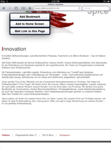
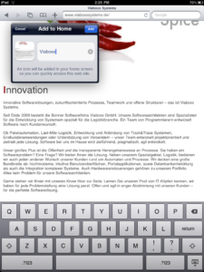
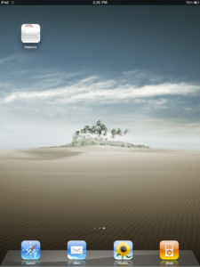
Normally, a screenshot of the site is taken and transformed into a kind of icon on the home screen. To optimize the icon, you can provide your own icon with the size of 57 x 57px, which is used instead of the screenshot. If you search around the web, you will find different sizes, but this was a bug in an older firmware version.
<link rel="apple-touch-icon" href="/my_custom_icon.png"/>If you specify your icon in this way, there are used some effects like shining before it is used as an icon. If you want to use the icon as it is, you need to name the image file apple-touch-icon-precomposed.png. If you store an icon in the root folder with the previous name or apple-touch-icon.png you don’t need the link tag.
If your display resolution doesn’t fit or the aspect ratio chosen by Safari is hiding some parts of your HTML app, you can set the viewport width. This can be a specific value or a device-independent value. If you have a specific width, this is measured in pixel but written without unit.
<meta name="viewport" content="width=device-width" />Another post in this series will be about app distractions like user zooming, disable copy and paste, phone number highlighting, …
For more information about this topic, visit the sites:
- http://developer.apple.com/safari/library/codinghowtos/Mobile/UserExperience/index.html
- http://www.apple.com/ipad/ready-for-ipad/
- http://developer.apple.com/safari/library/documentation/AppleApplications/Reference/SafariHTMLRef/Articles/MetaTags.htm
- http://iphone.xkill.net/apps/WebApp_Hints/index.html
- http://mattgemmell.com/2010/03/05/ipad-application-design